 Description
Used to define a Button control in a form.
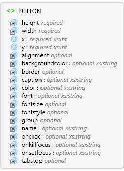
 Diagram
 Overview
 |
BUTTON
Used to define a Button control in a form.
 |
height required Restriction of xs:int
|
 |
width required Restriction of xs:int
|
 |
x required xs:int
|
 |
y required xs:int
|
 |
alignment optional Restriction of xs:string
|
 |
backgroundcolor optional xs:string
|
 |
border optional Restriction of xs:string
|
 |
caption optional xs:string
Displayed in the toolbar.
|
 |
color optional xs:string
|
 |
font optional xs:string
Font name. The name is case sensitive. If font name uses "&", use "&" instead. For example, ESRI Transportation & Civic should be written as ESRI Transportation & Civic.
|
 |
fontsize optional Restriction of xs:int
Font size.
|
 |
fontstyle optional Restriction of xs:string
Font style. If the value is not regular, it can be any combination of other values, expressed as a comma delimited list (for example, fontstyle="bold,underline")
|
 |
group optional Restriction of xs:string
|
 |
name optional xs:string
When parent is ToolButton:
Custom tool name. Used to reference the tool in scripts.
|
 |
onclick optional xs:string
Specify the script to run when this event occurs.
|
 |
onkillfocus optional xs:string
Specify the script to run when this event occurs.
|
 |
onsetfocus optional xs:string
Specify the script to run when this event occurs.
|
 |
tabstop optional Restriction of xs:string
|
|
 Attributes
| Name | Type | Use | Default | Fixed | Description |
|---|
| height | Restriction of xs:int | required | | | |
| width | Restriction of xs:int | required | | | |
| x | xs:int | required | | | |
| y | xs:int | required | | | |
| alignment | Restriction of xs:string | optional | left | | |
| backgroundcolor | xs:string | optional | | | |
| border | Restriction of xs:string | optional | false | | |
| caption | xs:string | optional | | | Displayed in the toolbar. |
| color | xs:string | optional | | | |
| font | xs:string | optional | | | Font name. The name is case sensitive. If font name uses "&", use "&" instead. For example, ESRI Transportation & Civic should be written as ESRI Transportation & Civic. |
| fontsize | Restriction of xs:int | optional | | | Font size. |
| fontstyle | Restriction of xs:string | optional | regular | | Font style. If the value is not regular, it can be any combination of other values, expressed as a comma delimited list (for example, fontstyle="bold,underline") |
| group | Restriction of xs:string | optional | false | | |
| name | xs:string | optional | | | When parent is ToolButton:
Custom tool name. Used to reference the tool in scripts. |
| onclick | xs:string | optional | | | Specify the script to run when this event occurs. |
| onkillfocus | xs:string | optional | | | Specify the script to run when this event occurs. |
| onsetfocus | xs:string | optional | | | Specify the script to run when this event occurs. |
| tabstop | Restriction of xs:string | optional | true | | |
 Examples
 Source
<xs:element name="BUTTON" maxOccurs="1" xmlns:xs="http://www.w3.org/2001/XMLSchema">
  <xs:annotation>
    <xs:documentation>Used to define a Button control in a form.</xs:documentation>
  </xs:annotation>
  <xs:complexType>
    <xs:attribute ref="height" use="required" />
    <xs:attribute ref="width" use="required" />
    <xs:attribute use="required" name="x" type="xs:int" />
    <xs:attribute use="required" name="y" type="xs:int" />
    <xs:attribute ref="alignment" />
    <xs:attribute ref="backgroundcolor">
      <xs:annotation>
        <xs:documentation>The background color to use for the button. If not specified, this value is inherited from the page's backgroundcolor attribute.</xs:documentation>
      </xs:annotation>
    </xs:attribute>
    <xs:attribute ref="border" />
    <xs:attribute ref="caption">
      <xs:annotation>
        <xs:documentation>The text appearing in the button.</xs:documentation>
      </xs:annotation>
    </xs:attribute>
    <xs:attribute ref="color">
      <xs:annotation>
        <xs:documentation>The color to use for the button's text. If not specified, this value is inherited from the page's color attribute.</xs:documentation>
      </xs:annotation>
    </xs:attribute>
    <xs:attribute ref="font">
      <xs:annotation>
        <xs:documentation>The font to use for the button's text. If not specified, this value is inherited from the page's font attribute.</xs:documentation>
      </xs:annotation>
    </xs:attribute>
    <xs:attribute ref="fontsize">
      <xs:annotation>
        <xs:documentation>The font size to use for the button's text. If not specified, this value is inherited from the page's fontsize attribute.</xs:documentation>
      </xs:annotation>
    </xs:attribute>
    <xs:attribute default="regular" ref="fontstyle">
      <xs:annotation>
        <xs:documentation>The font style to use for the button's text. If not specified, this value is inherited from the page's fontstyle attribute. If the value is not regular, it can be any combination of other values, expressed as a comma delimited list (for example, fontstyle="bold,underline").</xs:documentation>
      </xs:annotation>
    </xs:attribute>
    <xs:attribute ref="group" />
    <xs:attribute ref="name">
      <xs:annotation>
        <xs:documentation>Name of the Button control. Used to reference the control in scripts</xs:documentation>
      </xs:annotation>
    </xs:attribute>
    <xs:attribute ref="onclick" />
    <xs:attribute ref="onkillfocus" />
    <xs:attribute ref="onsetfocus" />
    <xs:attribute ref="tabstop" />
  </xs:complexType>
</xs:element> |
 See Also


